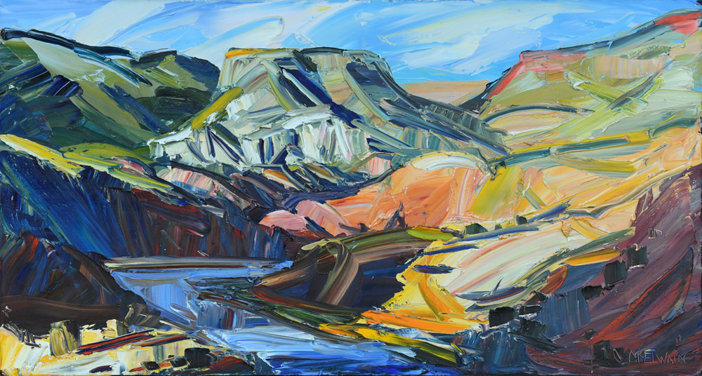
Louisa McElwain - Sweet Medicine
opening 2pm - 5pm, January 31 – April 18, 2026
Louisa McElwain's Sweet Medicine exhibition celebrates the artist's profound connection to the New Mexico landscape. Through her bold, gestural brushwork and vibrant palette, McElwain captures the spirit and energy of the high desert, inviting viewers into moments of transcendence and wonder.
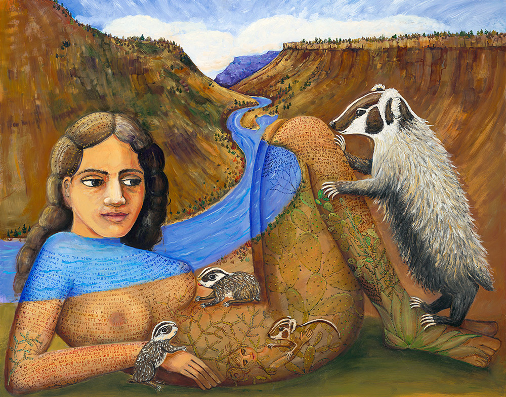
Madre del Mundo
Irene Hardwicke Olivieri & Nicholas Herrera
opening 2pm - 5pm, January 31 – February 21, 2026
A collaborative celebration of the sacred bond between humanity and nature. Irene Hardwicke Olivieri's richly detailed paintings and Nicholas Herrera's distinctive sculptural forms come together to honor the earth as mother and protector.
EVOKATION | art + culture + inspiration | April 2025 issue
Art is more than a form of expression; it is a fundamental part of human existence that enriches our lives in immeasurable ways. It shapes cultures, sparks imagination, and offers solace during difficult times. As a sanctuary from reality, art allows individuals to explore beauty, creativity, and emotion. Whether through painting, music, literature, or dance, it provides a medium for self-expression, healing, and reflection. Engaging with art stimulates the mind, nurtures emotional well-being, and deepens our understanding of the world around us.
Beyond personal enrichment, art fosters a sense of connection and community. It brings people together through shared experiences—bridging gaps between cultures, generations, and backgrounds. The universality of art reminds us of our shared humanity, fostering empathy, dialogue, and understanding. Even in the face of adversity, art continues to be a source of strength and transformation, proving its timeless and unifying power.
We are embracing this vision with a dynamic lineup of exhibitions and events for 2025. Our summer salon has become an intrinsic part of this mission, serving as a platform for conversation, inspiration, and the convergence of critical and creative thought. This year, we will expand our programming with more public talks featuring artists, curators, and visionary minds, alongside artistic demonstrations and multidisciplinary events spanning performance, literature, and the visual arts.
Join us at Evoke Contemporary for a year of vibrant creativity, thought-provoking dialogue, and immersive artistic experiences!
read past issues ►
Gallery Info
Founded in Santa Fe, NM in 2009, EVOKE Contemporary remains committed to providing a dynamic platform for exploring bold and thought-provoking contemporary art. The gallery is dedicated to fostering the careers of artists who embody authenticity, mastery, and vision, while nurturing works of profound depth and context. EVOKE Contemporary champions a diverse array of voices and artistic disciplines, representing artists whose work delves into the human condition, explores complex social values, and celebrates the beauty of nature and the human form.
EVOKE Contemporary is centrally located in the Railyard Arts District of Santa Fe along with the New Mexico Museum of Art Vladem Contemporary, and SITE Santa Fe, a contemporary art space, and seven additional contemporary art galleries. The Railyard district, a short walk from the historic Plaza, offers a Farmers Market, the Railyard Park, and an array of shopping, dining and, entertainment opportunities.
Gallery hours are: Tuesday through Saturday, 10 - 5.
You may reach us via Email and 505.995.9902 telephone messaging daily 10 - 5.
Thank you for your continued support.
LOOKING & SEEING
contemplations on a theme
Museums and Donating Artwork
John O'Hern is an arts writer, curator and retired museum director who has been providing a biweekly contemplation of a single work of art from our gallery. He is continuing his series of contemplations of various themes inspired by our gallery artists. In our fast-paced lives overflowing with information, we find it necessary and satisfying to slow down and take time to look. We hope you enjoy this perspective from John.
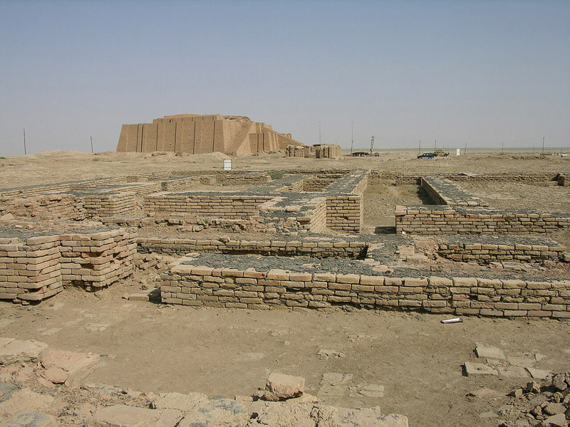 Ruins of Ennigaldi-Nanna's museum in the town of Ur, Southern Iraq
(photo: M. Lubinski via Wikipedia Commons, CC BY-SA 2.0)
Researching the history of museums, I was surprised to learn that the first known public museum dates to ca. 530 BCE! Ennigaldi-Nanna was the daughter of Nabonidus, king of the Neo-Babylonian Empire. She learned the history of the region from her father who was an archaeologist and displayed Mesopotamian artifacts in a temple near the king’s palace in Ur with clay “labels” in several languages. They were discovered during an excavation in 1927. Even ancient history has ancient history.
The Capitoline Museums in Rome are considered the oldest public museums in the world, founded in 1471 with a gift of ancient sculptures by Pope Sixtus IV.
In the U.S., the Charleston Museum in South Carolina was founded in 1773. It has a gallery dedicated to its Early Days where visitors can “see exotic collections from around the world, representative of the Museum’s nineteenth century cosmopolitan collecting focus. . . This gallery recreates the appeal that the Museum traditionally had for visitors as a ‘window to the world.’” The museum has since changed its mission focus “solely to the history of Charleston and the Lowcountry.”
Museums have often been founded on the personal collections of generous patrons. The Morgan Library and Museum, is the financier J.P. Morgan’s private museum built adjacent to his home in Manhattan. After his death, his son, Jack, according to the museum, “realized that the library had become too important to remain in private hands. In what constituted one of the most momentous cultural gifts in U.S. history, he fulfilled his father's dream of making the library and its treasures available to scholars and the public alike by transforming it into a public institution.”
Farther uptown, Henry Clay Frick’s home became a museum in 1935 after modifications to suit a public institution. The Frick Collection recently completed its first comprehensive renovation since that time, “To ensure the continued quality of the Frick experience, we undertook a newly completed renovation and enhancement project that enables us to better serve a twenty-first-century audience.”
Museums change their physical facilities and their missions to reflect the times and their educational purpose.
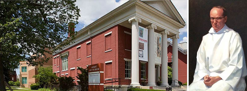 Left: Arnot Art Museum, Elmira, NY.
Right: Thomas S. Buechner (1926-2010), John, Collection of the Arnot Art Museum, Elmira, NY
My last museum role was executive director and curator of the Arnot Art Museum in Elmira, NY. The Arnot Art Gallery was founded through the bequest of Matthias H. Arnot who left his home, collection and an endowment to a board of trustees. His collection includes important works by Jan Brueghel (the Elder) Claude Lorrain, Gérôme, Bouguereau, Millet and others. The home was built in 1883, the year of his birth, by his father.
In the 1890s, Matthias commissioned a picture gallery which has been restored to its original appearance and houses one of the last existing private collections still housed intact in its original showcase. In 1982, the museum hired the architect Gordon Gund to design and build a three-story addition.
At the beginning of my 18-year stint at the Arnot Thomas S. Buechner (1926-2010) asked me to sit for his portrait painting group. Tom was the founding director of the Corning Museum of Glass and then director of The Brooklyn Museum before returning to Corning to paint. He asked me to wear something that might be difficult to paint! Tom later gave the painting to me and I gave it to the museum.
The Arnot had acquired 19th and 20th-century art over the years and, in 1993, we added “a primary focus on representational art” to its mission and I began a biennial series of exhibitions of contemporary representational art.
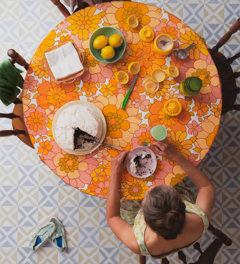 Lee Price, Summer, oil on linen, 42" x 38". Donated to the Arnot Art Museum, Elmira, NY.
Emilie Price, who taught at Elmira Free Academy, asked if I would look at paintings by her daughter, Lee. It’s always a difficult moment of diplomacy when recommendations like that are made. But, Lee submitted two extraordinary, small paintings of gold damask for a Regional exhibition. I was blown away. It’s been great to follow Lee over the years, and I included her paintings in several exhibitions I curated here at Evoke.
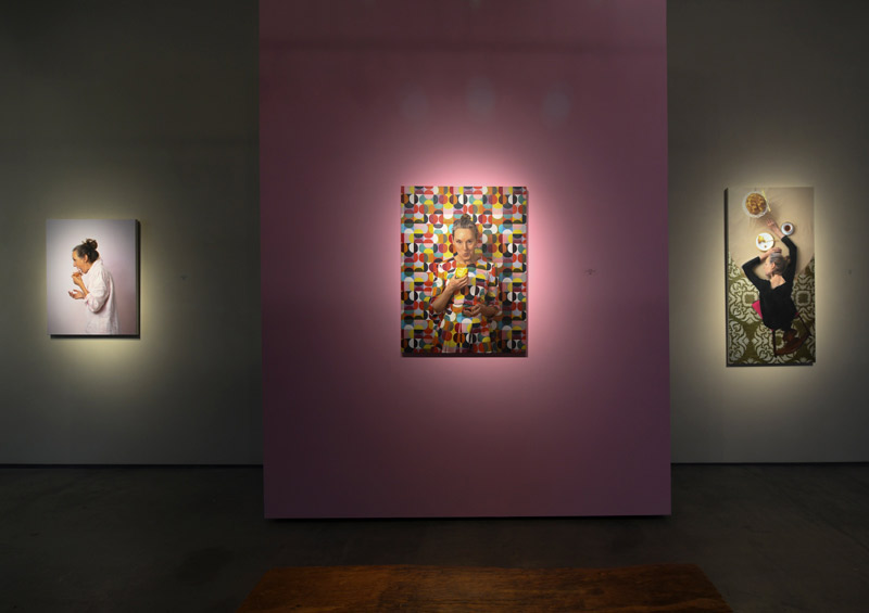 Installation of Lee Price's paintings at EVOKE Contemporary.
Her painting, Summer, will soon become part of the Arnot’s collection, the gift of a Santa Fe collector who was born in Elmira. He is dedicating the painting to his parents as well as honoring Lee and the museum where he was first introduced to fine art.
Sometimes, donations come about in odd ways. When I was hanging up my coat before dinner at a patron’s house in Elmira, I saw a wood carving on the floor of the closet. I asked the patron, “Is that a William Zorach?” My hostess responded, “Yes. Do you want it?” I immediately began thinking of where it would look best in my home but realized she wanted to know if I wanted it for the Arnot collection—where it now resides.
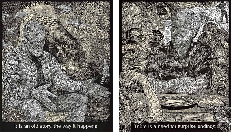 Individual woodcuts from the 12-print suite The Room, by Alice Leora Briggs given to the Library of Congress.
Sandy Besser, the late Santa Fe collector, and an extraordinary donor to major museums, also donated a piece to the Arnot. He gave works by Alice Leora Briggs to the de Young Museum in San Francisco and to Crystal Bridges Museum of American Art in his native Arkansas.
Alice told the former poet laureate Mark Strand that she loved his poem The Room, but she didn’t understand it. He replied, “Love comes first and understanding later.” Alice created a series of 12 woodcuts with chine collé inspired by lines in the poem. A boxed set of the suite was purchased by collectors and donated to the Library of Congress.
Museums have collection management policies to determine what gifts it will accept that complement their mission. A museum’s acceptance of a gift of art which it then displays can provide a tax deduction for the donor.
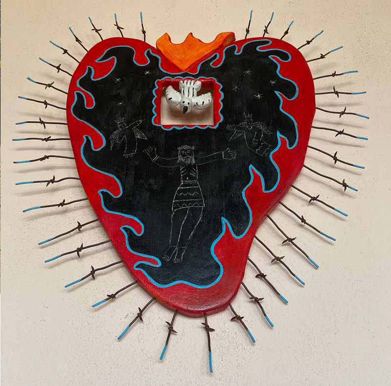 Nicholas Herrera, Alma de Coraźon II, donated to the Harwood Museum of Art, Taos, NM.
A concise example of a policy is provided by the Harwood Museum of Art in Taos. It states: “The Museum appreciates the generosity of donors who wish to make gifts of art. Donating artwork requires special attention and every donation must undergo a formal review process. Although a work may be artistically significant, it may not be appropriate for the Harwood Museum of Art’s collection. Please see our Collections Management Policy for a full list of criteria for accessions. If or when a work of art is accepted, it will be cared for to the highest standards and displayed for the scholarship and enjoyment of generations to come.”
Last year, the Harwood presented a 10-month exhibition of the work of another Evoke artist, Nicholas Herrera: El Rito Santero. At the close of the exhibition, collectors donated his Alma de Coraźon II to the museum.
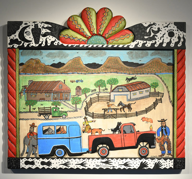 Nicholas Herrera, Cargando de los Caballos, acrylic on hand carved wood, 35" X 38".
A museum can refuse a donation for a number of reasons, especially if the work of art is not in sync with its mission, it may not have space to store it and, in the case of extremely important works, it may not have the funds to maintain or conserve it. From the artist’s point of view, however, the cachet of having a piece in The Met, for instance, doesn’t matter much if the work disappears into its vast collection of 1.5 million works of art.
Researching museums and their collections and talking with their curators can help find a suitable home for a work of art. Consulting with a qualified appraiser to determine value and an accountant who is familiar with ever-changing tax laws are important aspects of considering donations.
Unfortunately, professional artists are not able to donate a work to a museum and get a tax deduction for its market value. They are only able to deduct the cost of materials.
Donating a work of art to a museum provides entertainment and enlightenment to the public, enhances an artist’s reputation, and complements a museum’s mission.
There are continuing debates about museums being repositories or participatory entertainment centers. The Mexican painter Gabriel Orozco sums up what I believe to be the experience of museums, whatever their philosophy of presentation or interpretation—the experience and the impact of the work of art itself. He said, “. . . what is important is not so much what people see in the gallery or the museum, but what people see after looking at these things, how they confront reality again. Really great art regenerates the perception of reality; the reality becomes richer, better or not, just different.”